Creating user flows
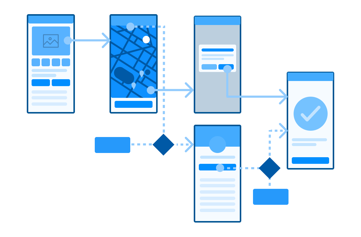
A user flow is a diagram that maps out each step a user takes when using a product or service.
They are typically attached to a specific persona and entry point.
Therefore, when using this type of flowchart, you may have many different scenarios that start at different places, with different user groups following different paths.
Even when user flows can have multiple paths, the main task or accomplishment is usually always the same.
This doesn’t have to be perfect but can be helpful to ensure consistency in the design and help the user through the journey, particularly if the service or product spans multiple teams.

Source: Career Foundry
Wireframing, mock-ups and prototyping
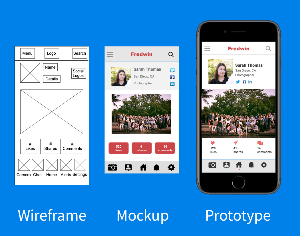
Your wireframes, mock-ups and prototypes are the best way to test your designs, catch mistakes or find ways to improve your product or service. The difference between the three are:
Wireframe
A web page layout stripped of visual design used to prioritize page elements based on user needs.
Prototype
A sample or simulation of a final product used to test and gather feedback. Low-fidelity prototypes might be sketched on paper and don’t allow user interaction. High-fidelity prototypes are typically computer-based and allow for mouse and keyboard interaction.
Mock-up
A realistic visual model of what a final webpage or application will look like.

Source: Aha!
Read our guide to prototyping.
Learn visual communication and UI
Visual cues can have a big impact on how people use your product or service.
As a designer, you should understand visual communication concepts like:
- Layout
- Colour
- Typography
- Icons
- Images
Here are some questions to help you check for good visual communication:
- Is it clear where the person needs to click?
- Is the font clear and easy to read?
- Do the colours distract from the content?
- Do the colour choices add value to the user experience (such as helpful grouping)?
- Is the page structure clear to help the person find the information they need?
- Do images and icons help the user to understand the information, or do they not add value?
- Are the icons supported by text?
- When icons are used, are the meaning easily understood by users?
Learn more about visual design
-
3 Ways to Level Up Your Visual Design Skills by Nielsen Norman Group
Learn UX writing and content
UX writing is different from content design. UX writing refers to the small pieces of content that are part of the design, which are not part of the main content on that page. These will influence how easy it is for people to navigate the interface and how likely they are to continue using it.
When working on the main content of the page, please follow content design approaches and principles. Read how to improve your content.
If you are working on a design, it is important to carefully consider the microcopy. Microcopy includes things such as:
- button text
- the phrasing of error messages
- Instructions
- calls to actions
- captions
When making design decisions you should consider content and writing.
Content inventory, grouping, and audits
It is important to know what content exists, where the content is, and the relationships between content. Before any design work starts, there must be an understanding of the content that will be making up the webpage or application.
Taxonomy and labelling
Designers organise content items based on similarities. Items may be classified according to sections, categories, or metadata tags.
Hierarchy and navigation
Designers must determine the structure and determine how users will move through that structure.
Designers use information architecture to ensure that important information is easily accessible to users.
User research and testing for designers
All designs should start with research or testing with real people who use your product or service.
Gathering quality information from your users as they interact with a service or product is one of the critical designer skills to develop.
When testing your services with users, you can separate UX and UI by the types of questions you ask.
Designers will work closely with user researchers to better understand user behaviours, mental models and needs.
If you don’t have access to a user researcher, we have a handy guide to help you to start with user research and another guide to help with testing.
Observing the way people interact with your designs makes your product or service better – for your users and for you. This means testing what they like, dislike, or where they get stuck in a process.
To test UI, you can ask users technical questions about interfaces, for example:
- Was the information easy to find?
- Was it clear where to click to complete your task?
- Were you able to easily navigate to the right section?
To evaluate UX, you need more emotional and psychological questions and answers.
- How did [this] make you feel?
- Did you have a positive experience?
- What did you take away from your interaction?
Coding and development
Many interaction designers have some programming skills to help them understand what the limitations are in designs.
Many designers will, when necessary, prototype in code to give users an experience during testing that is close to the real user experience.
We won’t teach you to code here but here is a quick overview of the different types of front-end codes to understand to help with design conversations:
- HTML. This markup language is used to format the structure of a page. All the content/ words on a page will be in HTML.
- CSS. This is the style sheet for the web page and so will give the HTML some “style rules” which enables the manipulation of font, colour, size, layout, and more.
- Javascript. This scripting language is used to implement dynamic, interactive features.
